
We have all done it. You are driving along listening to your favorite disco album and BAM! You see a sign and recognize the logo or message; and then pull in because you remembered a purchase you need to make. Signage impressions influence us all the time. Yet, do we realize why the sign had impact? Below we have listed 3 quick n’ easy tips to help your signage designs create the same impact:
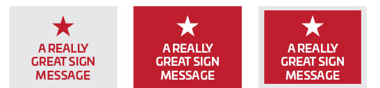
Reversed Lettering- reversing artwork colors and providing a darker background creates good contrast and makes you message or logo stand out more than if placed on a plain white background. Ideally full bleeds are used up to the edge of the material; but even a white border can be used for coverage cost effectiveness. See for yourself in the below example.
Easy-to-Read Fonts- fonts used for commercial signage should be easy to read from a distance, and you should always keep in mind the final location of where the sign will be installed. Will it be away from a major roadway and setback 2,000 feet from the intended viewers? Is it on a shopping plaza marquee where the phone number will need to be legible for a quarter mile? Unfortunately logos provided by clients do not always lend themselves to this design principle; yet the message that their sign needs to convey can almost always be produced with a highly legible typeface. Here are some examples of good and bad font usage:

Intended Message is Short and to the Point- Remember that most forms of commercial signage are only receiving mere seconds of viewing per impression- so keep your message short. There are always exceptions to this, especially if the installation is for informational purposes such as commercial real estate, museum or memorial applications. Just keep in mind, when reviewing initial information for signage with clients, what is the intent or impact they are trying to achieve with the sign placement. Primarily it is their name, service, website and/ or phone number. Keep additional information to a minimum as this can be obtained via one of the aforementioned channels.
So what else makes for good signage? Starting with a good, high-quality substrate. While you’re here have a look at our complete line of UltraBoard products and get your sign design right from the start.
Check out UltraBoard Foam Core Boards